Tech Inquiry BlogPost #4

By watching this video, we were able to learn that colour is an important aspect of graphic design and that colour is all around us. Colour can evoke a certain mood or emotion and therefore it is important to understand the basics. Colour theory is something that we learn from a young age. Colour theory is primary (red, blue, yellow) and secondary (orange, green, purple) colours.

The main components of colour to consider are:

  • Hue → the colour itself (ex. blue)
  • Saturation → how intense the colour is (ex. turquoise vs. navy)
  • Value → how dark or light a colour is on a scale going from white to black

The colour wheel is a key element to learning about colour. By using the colour wheel, we are able to achieve colour harmony. There are several different types of colour harmony:

  • Monochromatic – one colour/hue, these colours will always match (ex. red and pink)
  • Analogous – colours that are next to each other on the colour wheel (ex. red and orange)
  • Complimentary – colours that are opposite on the colour wheel, this adds variety (ex. blue and orange)
  • Split Complimentary – three colours using the ones on either side of the compliment, to form a triangle (ex. red, green yellow, green blue)
  • Triadic – three colours that are evenly separated, creates a sticking effect (ex. orange, purple, green)
  • Tetradic – four colours that create a rectangle on the wheel, two complementary pairs, often one will dominate and the others will serve as accents (ex. purple, orange, yellow, blue)

Here are some final tips for working with colours:

  • make sure your colours are readable and letters can be seen
  • too much colour can be overwhelming
  • balance colours with white, black, and grey
  • consider the tone of the message you are sending (less saturation can be more professional looking

Here are some colour palettes:

Open Inquiry Blog Post #8

After I lost my streak, my Duolingo practice has become a little sporadic. As a result, the Duolingo Owl has been accosting me. My entire inbox is full of passive aggressive reminders from Duolingo, saying (threatening?) that I should “keep the owl happy”. I tried to unsubscribe, but I keep getting emails. Receiving these emails does not actually motivate me to practice my Italian. However, I know that I should keep learning because I want to have at least passable Italian when I go to Italy in May. I have turned to YouTube videos to help me learn lately. There are endless videos on how to learn languages on YouTube. What I have learned, is that you just have to try them out and see which ones help you learn. Sometimes, while watching a video, it is tempting to watch passively. However, if you are actually trying to learn new information, you must be an active participant in the video. I have linked the videos that I have found to be the most helpful below.

Open Education: Creative Commons: Copyright in the Classroom

Today in class we talked about the importance of being mindful of copyright policies when using other people’s photos. Before this semester, I had never given much thought to this issue. In elementary and high school, I routinely used random google images for school projects. I never thought about the problems with using other people’s work when expressing and curating my own ideas. Now, I am much more aware of the importance of adhering to the laws around fair dealing in Canada.

It has become abundantly clear that very few people actually know anything about the laws around copyright. Even some prominent organizations, like the Council of Ministers of Education, Canada, are not completely clear about how to copyright their own resources. Ironically, in their guide for teachers, CMEC did not even mention creative commons. Creative Commons is an organization that strives to increase availability of legally shareable resources online. Here is a description from their website:

The CC Search beta makes it easy to search for content with clear copyright instructions.

Based on what you are using the content for, you can choose to select “use for commercial purposes” and/or “modify, adapt, or build upon”.

Most of the content on my blog is my own. However, at some point I will inevitably need to use somebody else’s content. I am grateful that I now have a viable search platform on which to look for content.

Tech Inquiry Blogpost #3

Typography

noun.

— The style or appearance of text

— The art of working with text

retrieved from: HTTPS://WWW.YOUTUBE.COM/WATCH?V=SBYZHOIYFX0

Before starting this project I never ventured out & used a font besides times new roman in my projects. As we progress with our tech inquiry project, we have to start thinking about everything that contributes to graphic design. For example, something as small as picking the font you use for a project can have a huge impact on how your audience perceives your work. This video by GCFLearnFree.Org describes the basics of working with typography, what fonts to use, which ones to avoid & how to make your work stand out above others. I found this video very helpful for beginning graphic designers like myself.

Good Fonts

  • Serif fonts- perfect for more traditional projects, print publications; gives your document a more classy look
  • Sans Serif fonts- more clean & modern than serif fonts; easier to read
  • Display fonts- many different styles; very decorative so great for titles & headers but not large amounts of text

Bad Fonts

  • Comic Sans
  • Curlz
  • Papyrus
  • Anything else you would have used when creating a project for a middle school class
  • All are outdated & overused

Tips & Tricks

  • Less is more- limit yourself to one or two fonts per project
  • Make combinations- experiment w/ using the same font but a different size, weight or style
  • Opposites attract- decorative w/ simple, all caps w/ lowercase, tall w/ short, big w/ small
  • Guide the readers eye towards what is most important in a project- make that different in some way
  • Always use spacing that makes your text as easy to read as possible

Now that you know a bit more about typography I encourage you to give it a try! How can you turn an ordinary project into an extraordinary one?

Open Inquiry Blog Post #7

I have never had my heart broken, but I think I know what it must feel like. You guessed it, I lost my 30 day Duolingo streak. I have been trying to do my Duolingo lessons before bed, as an experiment to find out if it helps me remember more, and I think that this was my down fall. I like to wake up in the morning and be productive. For a long time, Duolingo was one of the first things I did when I woke up. I loved the feeling of being able to check it off my to do list right away. I think that I should go back to doing my lessons in the morning. When I said that my heart is broken, I was obviously being facetious. I am feeling a little discouraged, though. I don’t particularly like the look of this graph:

As I have said from the beginning though, Duolingo is not the be all and end all. I am taking my lost streak as motivation to try out some other methods. In my last blog post, I talked about cognates (words that are similar or almost exactly the same in your native language and the language that you are learning). I found an article all about Italian and English cognates that I have found really helpful. It provides some grammatical rules which I will list below:

  1. When an English word has the suffix “ty”, its Italian cognate has the suffix “tà” (e.g. “generosity” vs. “generosita”)
  2. When an English word has the suffix “ble”, its Italian cognate has the suffix “bile” (e.g. “adorable” vs. “adorabile”)
  3. When an English word has the suffix “tion”, its Italian cognate has the suffix “zione” (e.g. “education” vs. “educazione”)
  4. When an English word has the suffix “ly”, its Italian cognate has the suffix “mente” (e.g. “probably” vs. “probablimente”)
  5. When an English word has the suffix “ic”, its Italian cognate has the suffix “ico” (e.g. “dramatic” vs. “drammatico”)
  6. When an English word has the suffix “ism”, its Italian cognate has the suffix “ismo” (e.g. “vandalism” vs. “vandalismo”)

It is also important to be aware of “false friends”. False friends are words that seem like cognates, but actually have different definitions. Here is a link to an article by FluentU that lists 14 of the most common fake friends between Italian and English : https://www.fluentu.com/blog/italian/italian-false-friends/

A Few Thoughts on Blogging

At the beginning of this semester, I did not think that I would find blogging to be a useful way to document my learning. Contrary to what I thought initially, I have actually found it helpful. After every EDCI 336 class, I write a blog post about what we did in class. Whenever I need to reference something that we did in class, I can just search for it easily on my blog. Blogging has also been helpful because it gives me a less formal setting in which I can organize my thoughts. It has also kept me accountable and focussed on doing my inquiry projects. Because I know I have to write weekly blog posts for each of those projects, it motivates me to practice my Italian skills and research information on graphic design. I thrive when I am in a routine, which is why I love being organized and making weekly blog posts.

I would love to blogging in my classroom one day. I change my mind about what grade I would like to teach, but as of right now, I would like to teach middle school. If I end up teaching middle school, I will likely ask my students to write blog posts. My students would ideally use these blogs to document their progress on inquiry projects and respond to prompts from me about various different subjects and issues. Blogs have value in the classroom because they encourage technological literacy while teaching other subjects. I have included the citation below of a fantastic article about blogging in a middle years context.

References:

Baldino, S. (2012). The classroom blog: Enhancing critical thinking, substantive discussion, and appropriate online interaction. Voices from the Middle, 22(2), 29-33.

Midterm Reflection – Ukulele

Learning the ukulele for the past month has presented many challenges, but has become a rewarding experience. At first, I had trouble tuning my ukulele and, since it was out of tune, everything that I played on it sounded bad. This discouraged me. It also deterred me from practicing every day like I had planned to at the beginning of the project, which set me back by about a week. I asked one of my friends to tune it for me and he tuned it an octave too high. When I came into music class and got it tuned properly, I was finally able to practice productively. I am glad that I chose to seek help because it meant that I could start to progress in a way that I am happy with. My other main issue was that I had long fingernails for the first couple weeks of practicing which made playing exceedingly difficult. When I finally cut my nails, I had a breakthrough: I was able to play a G7 chord! After this breakthrough, I started to enjoy practicing. I found several instructional videos that helped me develop a better understanding of how to change chords quickly and effectively. I found it helpful to try to play along with these videos. These videos are were also helpful because they show you how the song is supposed to sound on the ukulele. I have linked the two most helpful videos that I found below. I became more motivated to improve, which resulted in more practicing. My goal for the end of the semester is to be able to play the song “Riptide”, by Vance joy, on the ukulele and sing along at the same time. The chords required to play this song are A minor, C, G7, and F. My goal for the midterm assessment (this submission) was to be able to play all of the notes correctly and be able to sing along. I believe that I have achieved this goal. My goal for the end of the semester is to be able to strum properly (while still playing the notes correctly and singing along). Right now, I have just been strumming based on how I think the song should sound, rather than how it is written. I also want to become more confident with my singing by the end of the semester. I was in choir for all of high school, but have sadly lost most of the confidence that I gained by doing that. I am going to make an effort to sing in front of people in order to gain my confidence back.

Here are the two most helpful resources that I found:

I have chosen not to post the video of me playing. Hopefully I will gain enough confidence by the end of the semester to post my final result!

Open Inquiry Blog Post #6

It is day 28 today; I am have been learning Italian for 4 weeks now! Honestly, it is getting a lot more difficult. At first, I just learned the basics: common nouns and a few phrases. Lots of Italian words are similar to English words, so it was easy to identify them. They also provided pictures to go along with every noun which always gave away the answer.

Now, I am working on some more difficult components of language. I am having particular difficulty with possessives. I remember that this was challenging for me when I was learning French in school. Some of the Italian possessives are similar to French which is a blessing and a curse because sometimes it helps me remember and sometimes it just confuses me. For example, “our” in French is “notre” and it is “nostro” in Italian. This can be confusing, though.

I read an awesome article by Tim Ferris and Benny Lewis about learning languages. It outlines 12 rules for learning languages in “record time.” It also includes countless resources for language learners. The article is worth reading in its entirety, but I thought I would summarize it anyway:

The 12 Steps:

  1. Learn the Right Words, The Right Way: learn the words that are most frequently used in the language.
  2. Learn Cognates: cognates are “true friends” of words that you know in your native language (kind of like what I was talking about above with “notre” and “nostro”). You already know tons of words in the language that you are trying to learn!
  3. Interact Daily in your language without travelling: listen to the radio or watch TV in your desired language.
  4. Skype Native Speakers: I might not do this one because it creeps me out, but I understand that this method has merit.
  5. Do not pay to learn a language: the best resources are free!
  6. Realize that adults are actually better language learners than kids: you are NOT too old to learn a language.
  7. Expand your vocabulary by using mnemonic devices.
  8. Embrace Mistakes.
  9. Create S.M.A.R.T. goals: (Specific, Measurable, Attainable, Relevant, Time bound)
  10. Jump from “Conversational” to “Mastery”: Do a lot of spoken practice. Like, a LOT.
  11. Learn the accent. You will not sound like a native speaker until you develop an accent.
  12. Become a polyglot: Learn multiple languages!

Tech Inquiry

Maeve, Olivia, and I are all pretty unfamiliar with graphic design. Broadly, all of us are simply curious about what it is and how to do it. Specifically, we are interested in how we could use it to enhance our teaching practice. This article gave us a few ideas about how to do so. The article talks about using “C.R.A.P” principles of web design when creating infographics. C.R.A.P stands for contrast, repetition, alignment, and proximity. Contrast is vital in order to make the important elements stand out and the less important elements less obvious. The purpose of an infographic is to communicate information to viewers in a logical and clear way, which is why more important information should be more obvious. The article suggests making contrasts in the types of font, colours, line thickness, spacing between elements, and shapes. The “R” in C.R.A.P. stands for repetition. Graphic designers, according to the article, repeat certain elements of design (such as colour or shape) in order to “develop a sense of organization, unity, and consistency”. Most graphic design tools do this automatically when you choose a template, so this is not an area that you generally have to focus on. The “A” in C.R.A.P. stands for alignment. All design elements should be connected to the others in some way; nothing should be placed on the screen arbitrarily because this causes the design to come across as messy and disorganized. Lastly, the “P” in C.R.A.P. stands for proximity, which is important in order to communicate the relatedness of two or more concepts. Basically, when doing graphic design, be mindful of your creative choices.

The same article mentions that Canva can be helpful for teachers to design worksheets, infographics, schedules, posters, flyers, and more. Below I have included a screenshot of what the Canva website looks like.

Canva is free and easy to use. As far as I can tell, though, you have to pay for your images if you wish to remove the watermarks from them. If I were using them in the classroom, I wouldn’t mind if there was a watermark.

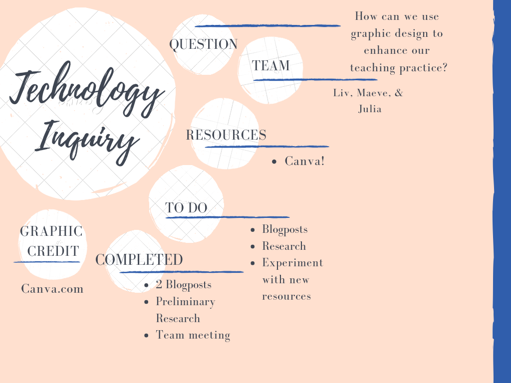
I have been experimenting with Canva and had lots of fun creating a concept map for this project (shown below). I am obviously not an expert, but I think it looks pretty good considering how new I am to graphic design! I am starting to see that there are lots of ways to use graphic design in my future teaching practice.

Canva also allows users to be collaborative on projects. For example, if Maeve, Liv and I wanted to work on a graphic design project together, I could just invite them to view my designs, edit, and share their designs. Last semester, we had to make a flyer for one of our classes. My group ended up making it on Microsoft Word and then emailing each other a draft with every small change that we made. If we knew about Canva, our lives would have been so much simpler.

Graphic Design Starting Point

For our tech inquiry project, the three of us (Olivia, Maeve, Julia) decided to learn about graphic design. Throughout our daily lives, we are constantly exposed to graphic design through digital and social media and in our everyday tasks. As young professionals starting out in the education world, being proficient in graphic design will be an asset to our classrooms and school communities.

As a starting point, none of really know much of anything about graphic design. We are aware that it is generally a combination of words and images that make up some sort of advertisement or logo, etc. We are not certain about how to do graphic design. We recognize that there are several outlets that we can use to create our own graphics but we are unaware of the differences between the outlets and which one is best suited to our needs.

To begin, we watched several videos about graphic design (like the one below) on Youtube. From there, we were able to learn several of the fundamental ideas about graphic design such as line, shape, and balance.

Our goals moving forward are individually different, but as a whole, we would like to further our knowledge and attempt some graphic designing. So far, one of us has used Adobe Spark  (which was free and easy to find) to create very small graphics. The website took some time to sort out and we are still learning what we can actually do with the site. We would like to explore the graphic design world a bit more and explore what kinds of things we would like to learn. We are in a state right now of almost not even knowing what we don’t know so we would like to delve further into this concept that is relatively new to us.

We’d like to experiment with different websites to try graphic design and hopefully, find ones that either doesn’t cost anything or that we can begin with a free trial. Once we become more adept, we will decide on our favourites and how they compare to others.